Tuesday, 9 March 2010

My Teaser Trailer Journey...


I like the use of simple colour on this cover. Also how the image is so powerful


Although I did not develop my magazine cover to look similar as this, I liked the use of colours and image used.


This image helped me develop my picture that I used on my magazine cover, as the close up of the face works well.

Empire Magazine Covers Which Helped With My Magazine Cover

Here I have included various empire magazine covers, which I used for inspiration when creating my magazine cover. It also helped me develope and challange conventions.

Tuesday, 2 March 2010

Media Text Research

Moral Panic: A semi-spontaneous or media-generated mass movement based on the perception that an individual, group, community, or culture is dangerously deviant and poses a menace to society. A public outcry.

Marketing - USP: Unique selling point. An aspect of a product/service that is unique which makes it more appealing, e.g extremely high graphics

Todorov's Theory: Todorov proposed a basic structure for all narratives. - Films and programmes begin with an equilibrium, a calm period then disruption causes disequilibrium. Then a new equilibrium brings chaos to an end. The simplest form of narrative is sometimes referred to as 'Classic' or 'Hollywood' narrative.

Male Gaze - Laura Mulvey's theory that women are almost always represented in a sexualised way in order to appeal to a male audience. This is not necessarily deliberate - she contended that the media is populated mostly by male photographers, directors, editors, lighting technicians and so on; thus, most of what is produced is made FROM a male point of view and in a way which will appeal TO males.

Propp's Theory: Vladimir Propp came up with the idea/theory that there are 8 types of characters in the basic storyline. These characters are: the hero, the villain, the donor, the dispatcher, the false hero, the helper, the princess (damsel in distress) and her father, [These people don't have to all be different people]. He also states that there are only 31 things that these characters can do (Sphere of Action). Once we identify the character we can guess the actions. e.g. A Fairytale

Friday, 19 February 2010

Ancillary task: Producing a film poster and magazine cover

Our next ancillary task is to produce a magazine front cover and film poster based on our teaser trailer. Our teacher halved our group of four into two for this task two people in my group would work on the film poster (Mariam and Jasmine) and the other two would work on the magazine cover. (Me and Sufia)

I started of by looking at the images that we took when filming and putting all the ones I though I liked and where effective into a folder called ‘’possible’’. The next lesson I then discussed with my partner the one which we liked most out of the ones I put into the ‘’possible.’’ We decided that we liked the picture where the actress Elizabeth was near to the camera (eye to eye contact), we felt that this one of the most effective picture out of all of them. Another reason why we chose a picture that was with straight eye contact was because as we where using the theme of EMPIRE magazine. From research we noticed that most images on EMPIRE magazine actors/actress had there eyes looking straight ahead this looked good and we decided to apply this technique. We started of my getting a clear image of the text EMPIRE, I then carefully cut it out using Photoshop. Once this was done we smoothed out the edges and pasted it onto our magazine first. We then next got our main image and cut around here and blended all the rough and uneven edges, we choose to smooth and blue her white gown, as the made is stand out more and give a better effect. The gaps we choose to colour in a misty black as this gave a scary feel. We then added on the text next, choose to put a catching text with the top of the magazine as this is convention we got we noticed from EMPIRE magazine. Our caption stated ‘’ Elizabeth’s mother has returned for….’’

We choose to put our film name ‘’ The Summoning’’ underneath the chin of the actress and kept the font colour white. We choose to do this as it worked well with the image and indicated that the film name linked with the image.

Underneath we choose to right ‘’ Introducing Jasmine Smith’’ the text got bigger underneath; we choose to do this as we developed a convention used by EMPIRE magazine. We chose this text colour font to be in red, this worked well with the cover and did not blend and overpower in with the film name.

Although I did not contribute in the actual creation of the film poster as that was my other to group partner’s role, I contributed to ideas which could be included to create a more effective film poster. We decided that we would surely use a picture that was taken of the actress (jasmine) in the woods, once this picture was taken we knew in an instance that this image would be used on our film poster. It was such an effective picture and looked so professional. The quality was very good and had a nice bright spark of sunlight beaming on the actress. My group members blurred the picture slightly to give it a cold looking effect to blend in with the woods, not much alteration was done to the actual picture itself as it was took almost perfectly. However, there was a branch from a tree that was in the way, my group members cleverly removed it with out it looking unprofessional, my group members choose to use the same font as what was shown in our trailer as we felt it went well with the theme, we choose to keep our poster simple out effective as this is what we saw with most other effective film posters currently out.

Quantitative Research

Thursday, 11 February 2010

Questionnaire/Feedback Questions

For our questionnaire we will be asking questions and there will be tick boxes (1-5 with 1 being strongly agree to 5 being strongly disagree) ALL WILL BE FOLLWED BY TIK BOXES .Here I have included the following questions we will be asking:

AGE …..
GENDER…..

1.) Our poster was successful in creating interest in the film
2.) Our poster compares well to professional posters
3.) Our magazine front cover? Five being the highest
4.) Our magazine front cover is as effective as professional magazine covers
5.) The poster and magazine front cover would influence me to watch the film?
6.) Is there anything in particular that you liked or disliked about the poster and the magazine front cover?

TEASER TRAILER
1.) our teaser trailer is professional
2.) you want to watch our film from watching the teaser trailer
3.) Is there anything practical that stood out/ you liked in the teaser?
4.) Is there anything particular that you disliked about the teaser? If so what?
5.) Our music added to the effect of the teaser trailer
6.) The camera shots helped to create a scary atmosphere
7.) How would you rate the teaser out of five? Five being the highest
8.) The poster, magazine front cover and the teaser trailer linked in well together
9.) What do think the film is about?
10.) Feel free to add any extra comments

Premier of our teaser: Date is now set


Our teaser will be shown on 12/02/210, on this day we will also be giving out a questionnaire to each person out our premier and from this questionnaire we should hopefully receive feedback from them which will be use full when coming to my evaluation.

Sunday, 17 January 2010

College Premier Of Our Teaser

My next job is to create invitations and questionnaires for feedback for the college premier of our teaser. This is still undergoing as we are not 100% sure on the dates yet. however, I will upload them once I have compleated them.

Link To Teaser

Now that our teaser is compleate I have included a links to it. This will help me to see what others think of it and hopefully get some feedback. The trailer has been uploaded to two sites to get a variety of feedback and hopefully more.

http://www.youtube.com/watch?v=IdBH2RtoX68
http://www.vimeo.com/8741357

Editing

Once all our filming had been completed it was time to start editing our footage. Although we all had specific roles within our group we all contributed to editing, weather it be given suggestions to making the changes. As I am not good with certain filming programmes I found it hard using Adobe Premiere however with practice and playing around with unwanted footage I became a little better and learnt some skills and techniques.

Now that our trailer had been uploaded me and my group started by putting the sequence of our trailer in the right order, this was mostly done by one of my group members, however later in the editing we all contributed in other sections of the editing.

As our trailer could not exceed a certain amount of time we had to decide which bits we would not include in our trailer and cut of unwanted and unnecessary footage.

The first part which was put together was the opening sequence which was of Elizabeth (actress) worshiping and praying to her late mothers photograph sounded by candles. We decided to speed this up to give a more frightening effect and to help fit into the amount of time we could include. However we slowed it down when the camera zoomed into the actresses face and when she opened her eyes. This gave a more scary effect and enhanced the abnormal eyes that she has, indicating that something was wrong with her. We made sure that between every scene that ‘’dip to black’’ effect on Adobe Premiere was used; as this gave a fluent and consistent feel and look to the trailer. The next scene was of a group of bird’s clustered together flying across in the sky fast. This scene was not included in our storyboard however, when looking back at the footage we liked the how it gave an apprehensive and scary fell to it.

The next scene was of Elizabeth walking towards the camera in the woods. We choose to speed this up to around 230-300 as it speeded up the trailer and gave a better effect that she was coming closer and quicker hopefully making the viewer feel on edge.

The next scene was on an investigator taking pictures of a covered dead body. We choose to shoot this from a medium long shoot so we could get both investigator and dead body in the same frame. This scene was approximately 3 seconds long, this was easy to edit as all we had to get was to include a quick glimpse of this.

The next scene was of a text hovering saying ‘’When evil takes over’’ we choose to keep all the texts that came in-between certain shoots the same to show consistency, we choose to use a black background and black writing with white and read on the edges hovering and shaking. this effect was achieved by going through affects in adobe premier, we choose the text scene(s) to be around 3-4 seconds long so it was just enough for the viewers to read it before it moved on to its next shoot.

The next scene was to speed up Elizabeth (actress) coming closer to the camera, we done this by speeding up around 200. Between these scenes the camera would then go to the shot when the camera is rushing through the woods it would then go back to the actress coming closer and closer until she reaches near the lens.
The next scene is of the shooting camera speed slowing down and showing a bloody hand on the woods floors. We slowed this down by reducing the speed of the scene also using adobe premier.

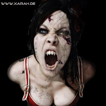
The next scene was of Elizabeth in her gown screaming hysterically outside in rain. As we used a hose pipe for the rain this was not noticed in the camera which was good, this helped the rain look real. We chose to use different shoot of Elizabeth in the rain screaming and put them together, we used a ‘’fade’’ effect to do this; this gave a fluent and smooth effect. This also showed different shoots and angles of Elizabeth in the rain, the last scene of the rain was of a closer shot of her face.

The next scene was of ‘’ Death’’ text this was done the same was as the previous text which I mentioned. It was on screen for the same amount of time and had the same colour scheme. The net shoot was of Elizabeth holding a knife with blood pouring out of her hand; this was shot in a close up as we wanted to enhance the blood and the knife. This was cut down to around 5 seconds. The next scene was of another text saying ‘’ destruction.’’

The next scene was of the camera tilting up from a grave stone, we choose to include this as it denotes death and maybe heartache. This scene was cut down to around 4 seconds and not speeded up as much as it was shot quit fast. Moving on, the next scene was of Elizabeth running across the floor, this was speeded up around 180, we done this as we felt it would give a more scary illusion. This was then faded to our production logo and name. This was created last and put in last however this was not hard to achieve. We choose our logo name to be on a still shot and be on screen for around 4 seconds.

The next scene then moves onto Elizabeth in a crap position upside done, we choose to do this as we got the idea from the exorcist and found it was scary. This scene had a bit of editing done to it as we choose to make her dress whiter using an effect which gave a 3.d look.

The next scene was of a picture of Elizabeth’s mother falling down whilst zooming out. This was done with a string attached to the picture being pulled. This shpt was speeded up around 200, we also included a dark outline around the photo, this was done as it emphasised the picture and gave a more scary illusion. This was done by simply adding a darkened effect round the edges of the photo. The next scene was of text saying ‘’ darkness follows’’ which was done in the same was as previous texts mentioned. The next scene was of Elizabeth in the woods in different spot coming closer to the camera this was done using 5 scenes. Ever time she came closer our sound track would have a noise which went with it. This was slightly hard as we had to match up tie sound with the right timing.

The next scene was of our teaser name, ‘’ The Summoning’’ and ‘’ coming soon’’ these were both done with a black background but with white text, we choose to use white text as it would stand out from the other text, also to show that it is the name of the teaser. We choose to use a zooming effect of the text with a spotlight in the left had corner; this gave an eye catching result. The music used for our teaser then finishes. This gives an illusion that the trailer has finished, however,

The next and last scene is of Elizabeth in the bath coming out gasping for air, this is the only scene that natural sound from Elizabeth is used.

Thoughout my teaser we choose to music soudn track Eximius84- Suman the demons. We had to cut out and edit the track to fit part of our trailer that we wanted it to.