Our next ancillary task is to produce a magazine front cover and film poster based on our teaser trailer. Our teacher halved our group of four into two for this task two people in my group would work on the film poster (Mariam and Jasmine) and the other two would work on the magazine cover. (Me and Sufia)
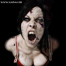
I started of by looking at the images that we took when filming and putting all the ones I though I liked and where effective into a folder called ‘’possible’’. The next lesson I then discussed with my partner the one which we liked most out of the ones I put into the ‘’possible.’’ We decided that we liked the picture where the actress Elizabeth was near to the camera (eye to eye contact), we felt that this one of the most effective picture out of all of them. Another reason why we chose a picture that was with straight eye contact was because as we where using the theme of EMPIRE magazine. From research we noticed that most images on EMPIRE magazine actors/actress had there eyes looking straight ahead this looked good and we decided to apply this technique. We started of my getting a clear image of the text EMPIRE, I then carefully cut it out using Photoshop. Once this was done we smoothed out the edges and pasted it onto our magazine first. We then next got our main image and cut around here and blended all the rough and uneven edges, we choose to smooth and blue her white gown, as the made is stand out more and give a better effect. The gaps we choose to colour in a misty black as this gave a scary feel. We then added on the text next, choose to put a catching text with the top of the magazine as this is convention we got we noticed from EMPIRE magazine. Our caption stated ‘’ Elizabeth’s mother has returned for….’’
We choose to put our film name ‘’ The Summoning’’ underneath the chin of the actress and kept the font colour white. We choose to do this as it worked well with the image and indicated that the film name linked with the image.
Underneath we choose to right ‘’ Introducing Jasmine Smith’’ the text got bigger underneath; we choose to do this as we developed a convention used by EMPIRE magazine. We chose this text colour font to be in red, this worked well with the cover and did not blend and overpower in with the film name.
Although I did not contribute in the actual creation of the film poster as that was my other to group partner’s role, I contributed to ideas which could be included to create a more effective film poster. We decided that we would surely use a picture that was taken of the actress (jasmine) in the woods, once this picture was taken we knew in an instance that this image would be used on our film poster. It was such an effective picture and looked so professional. The quality was very good and had a nice bright spark of sunlight beaming on the actress. My group members blurred the picture slightly to give it a cold looking effect to blend in with the woods, not much alteration was done to the actual picture itself as it was took almost perfectly. However, there was a branch from a tree that was in the way, my group members cleverly removed it with out it looking unprofessional, my group members choose to use the same font as what was shown in our trailer as we felt it went well with the theme, we choose to keep our poster simple out effective as this is what we saw with most other effective film posters currently out.
Subscribe to:
Post Comments (Atom)
No comments:
Post a Comment